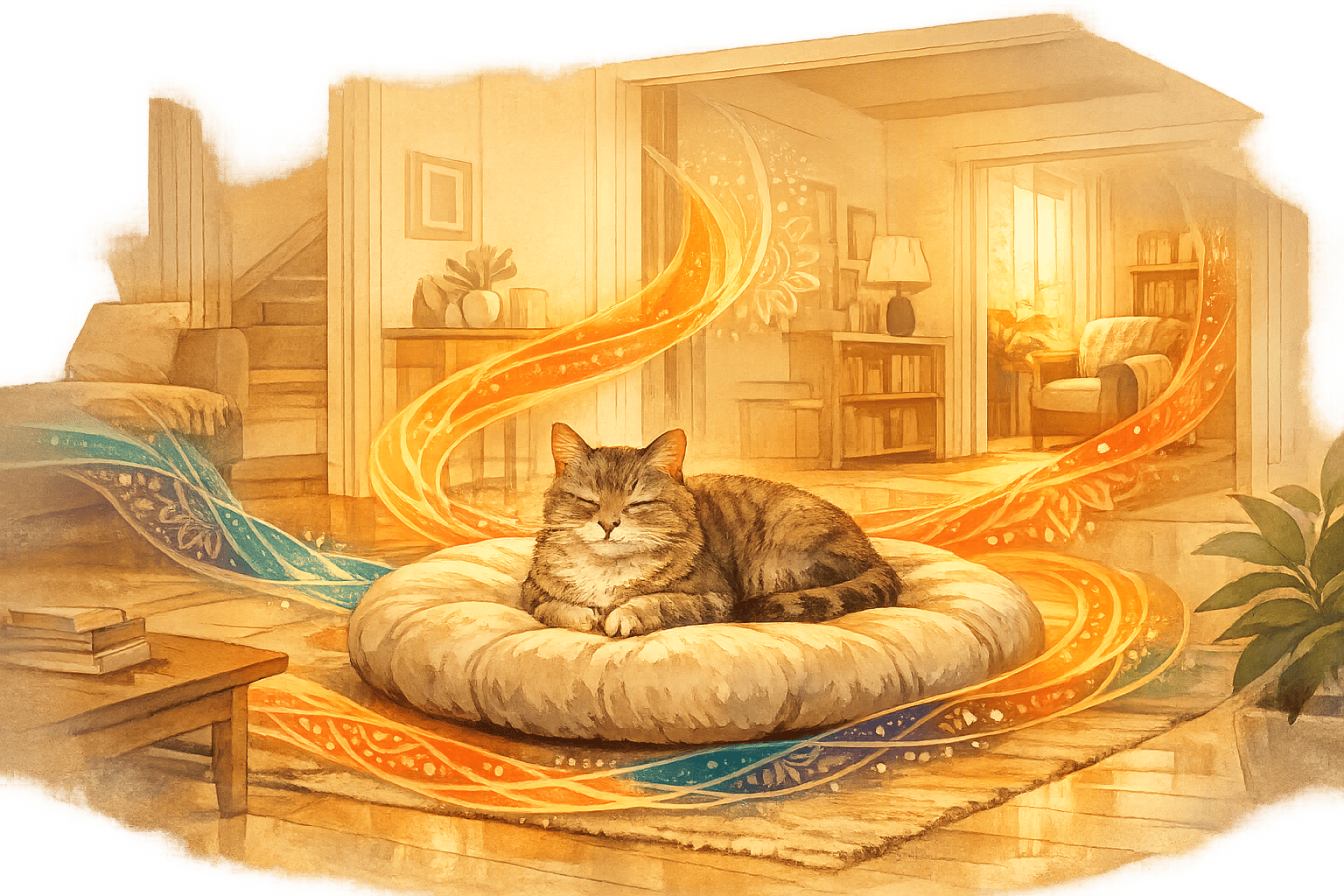
Mandala-Kunst verbindet Symmetrie und Farbe, um Designs zu schaffen, die zentriert und nachdenklich wirken. Indem Sie Farbkombinationen und Symbolik in der Mandala-Kunst verstehen, können Sie ausgewogene, bedeutungsvolle Muster kreieren, die mit Ihrer Stimmung und Ihren Absichten in Resonanz stehen. So gehen Sie beim Mandala-Ausmalen vor:
- Farben bewusst wählen: Warme Töne wie Rot und Orange spenden Energie, während kühle Töne wie Blau und Grün Beruhigung bieten.
- Mit einer klaren Absicht beginnen: Denken Sie über die Emotionen oder die Energie nach, die Sie ausdrücken möchten, bevor Sie Ihre Palette wählen.
- Einfache Farbschemata verwenden: Komplementäre, analoge oder triadische Paletten tragen dazu bei, Harmonie und Tiefe zu bewahren.
- Tiefe durch Farbverläufe und Kontraste hinzufügen: Mischen Sie Schattierungen innerhalb von Formen, um Dimensionen zu schaffen.
- Symmetrie beachten: Arbeiten Sie von der Mitte nach außen und wiederholen Sie Muster und Farben, um das Gleichgewicht zu erhalten.
Egal, ob Sie zur Entspannung oder zur Selbstdarstellung ausmalen, der Prozess kann dazu beitragen, Ihren Geist zu beruhigen und den Fokus zu schärfen. Beginnen Sie mit kleinen Schritten, experimentieren Sie mit Paletten und lassen Sie Ihr Mandala Ihre einzigartige Perspektive widerspiegeln.
Werkzeuge und Einrichtung für das Mandala-Ausmalen
Benötigte Malwerkzeuge
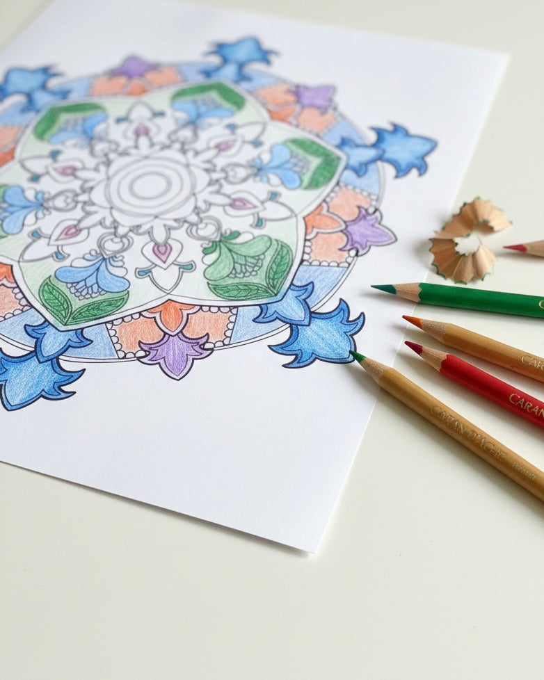
Die richtigen Werkzeuge können das Mandala-Ausmalen viel angenehmer machen. Buntstifte sind ein großartiger Ausgangspunkt, besonders für Anfänger, da sie Präzision und saubere Ergebnisse bieten und sich ideal für filigrane Designs eignen. Gelschreiber mit ihren feinen Spitzen sind perfekt, um kleineren Abschnitten Details hinzuzufügen. Für kräftige, lebendige Farben können Marker – einschließlich alkoholbasierter – Wunder wirken, erfordern aber dickeres Papier, um ein Durchbluten zu verhindern. Wenn Sie abenteuerlustig sind, könnten Sie Aquarellfarben oder Wachsmalstifte ausprobieren, obwohl diese spezifische Techniken und geeignetes Papier erfordern, um die besten Ergebnisse zu erzielen.
Wenn Sie Ihre eigenen Mandalas erstellen möchten, benötigen Sie einige grundlegende Zeichenwerkzeuge: Ein Bleistift, Lineal, Radiergummi, Zirkel und Winkelmesser sind unerlässlich, um die kreisförmigen Hilfslinien zu erstellen. Wenn Sie sich jedoch ausschließlich auf das Ausmalen konzentrieren möchten, können Sie die Zeichenwerkzeuge weglassen und direkt mit Ihrem gewählten Medium beginnen. Wählen Sie Werkzeuge, die zu Ihrem Stil passen – feine Werkzeuge wie Gelschreiber und Buntstifte sind perfekt für detaillierte Arbeiten, während Marker besser für größere, kräftige Abschnitte geeignet sind. Sobald Sie Ihre Werkzeuge ausgewählt haben, richten Sie einen Arbeitsplatz ein, der Ihren kreativen Prozess unterstützt.
Einrichtung Ihres Arbeitsplatzes
Ein gut organisierter und komfortabler Arbeitsplatz kann das Ausmalen angenehmer machen und Ihnen helfen, konzentriert zu bleiben. Stellen Sie zunächst sicher, dass Sie gute Beleuchtung haben, da dies die Augenbelastung reduziert und Ihnen hilft, Farben genau zu sehen. Ordnen Sie Ihre Werkzeuge in Reichweite an und erwägen Sie die Verwendung von mattem Papier, um Blendeffekte zu reduzieren und die Farben satt und lebendig aussehen zu lassen. Ein quadratisches Format, wie z.B. 20x20 cm Papier, eignet sich gut, um die Symmetrie in Mandala-Designs zu erhalten.
Um Ihre Oberflächen zu schützen, legen Sie ein Löschblatt – ein dickes Blatt Papier – unter Ihre Arbeit, besonders wenn Sie Marker oder Gelstifte verwenden, um ein Durchbluten zu verhindern. Halten Sie ein Stück Schmierpapier bereit, um Farben zu testen, bevor Sie sie auf Ihr Design auftragen. Dies ermöglicht es Ihnen, zu experimentieren, wie verschiedene Farben miteinander interagieren. Illustratorin Aletta Simpson schlägt vor, Ihre aktive Palette auf nicht mehr als acht Farben zu beschränken. Dies fördert Wiederholung und schafft einen harmonischen und beruhigenden Effekt in Ihrer Arbeit.
Üben mit Ausdrucken
Ausdruckbare Mandala-Vorlagen sind eine ausgezeichnete Möglichkeit für Anfänger, sich auf das Ausmalen zu konzentrieren, ohne sich um das Zeichnen komplexer Muster kümmern zu müssen. Diese Vorlagen eignen sich ideal zum Experimentieren mit verschiedenen Farbschemata, wie monochromatischen, komplementären oder analogen Paletten. Das Ausprobieren dieser Kombinationen auf demselben Design kann Ihnen helfen zu sehen, wie jeder Ansatz die Gesamtstimmung beeinflusst.
Wählen Sie bei der Arbeit mit Ausdrucken dickes, strapazierfähiges Papier, um das Schichten zu ermöglichen und ein Durchbluten zu verhindern. Bevor Sie sich für ein Design entscheiden, testen Sie Ihre Farben an den Rändern oder auf einem separaten Blatt. Denken Sie daran, dass Sie nicht jeden Abschnitt ausfüllen müssen – das Belassen von etwas Weißraum kann Ihrem Mandala ein leichteres, offeneres Gefühl verleihen. Das Üben mit Vorlagen hilft, Selbstvertrauen aufzubauen und Ihr Farbgefühl zu entwickeln, und bereitet Sie auf die Herausforderung handgezeichneter Designs vor.
sbb-itb-b6c1dc0
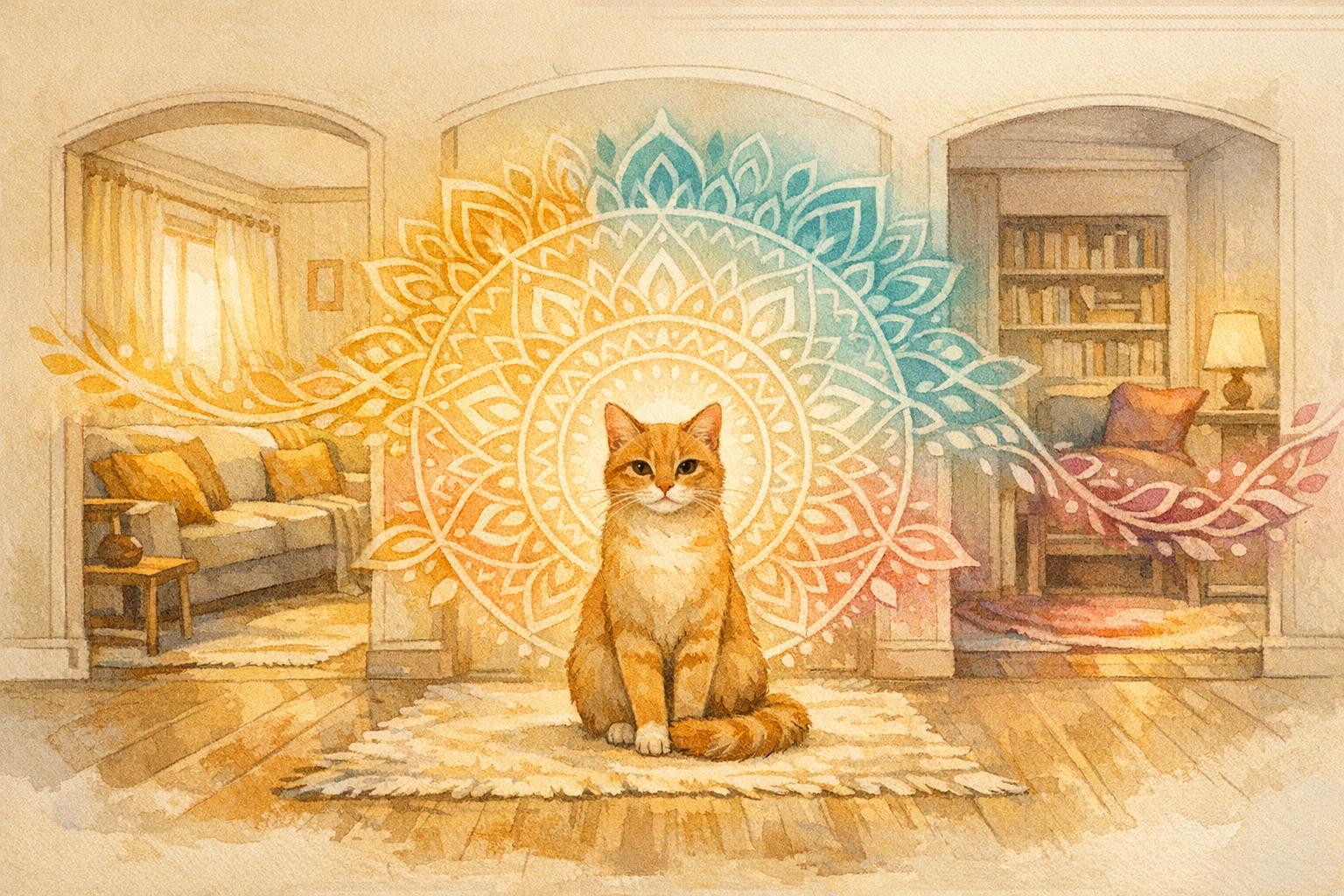
Farbsymbolik in der Mandala-Kunst
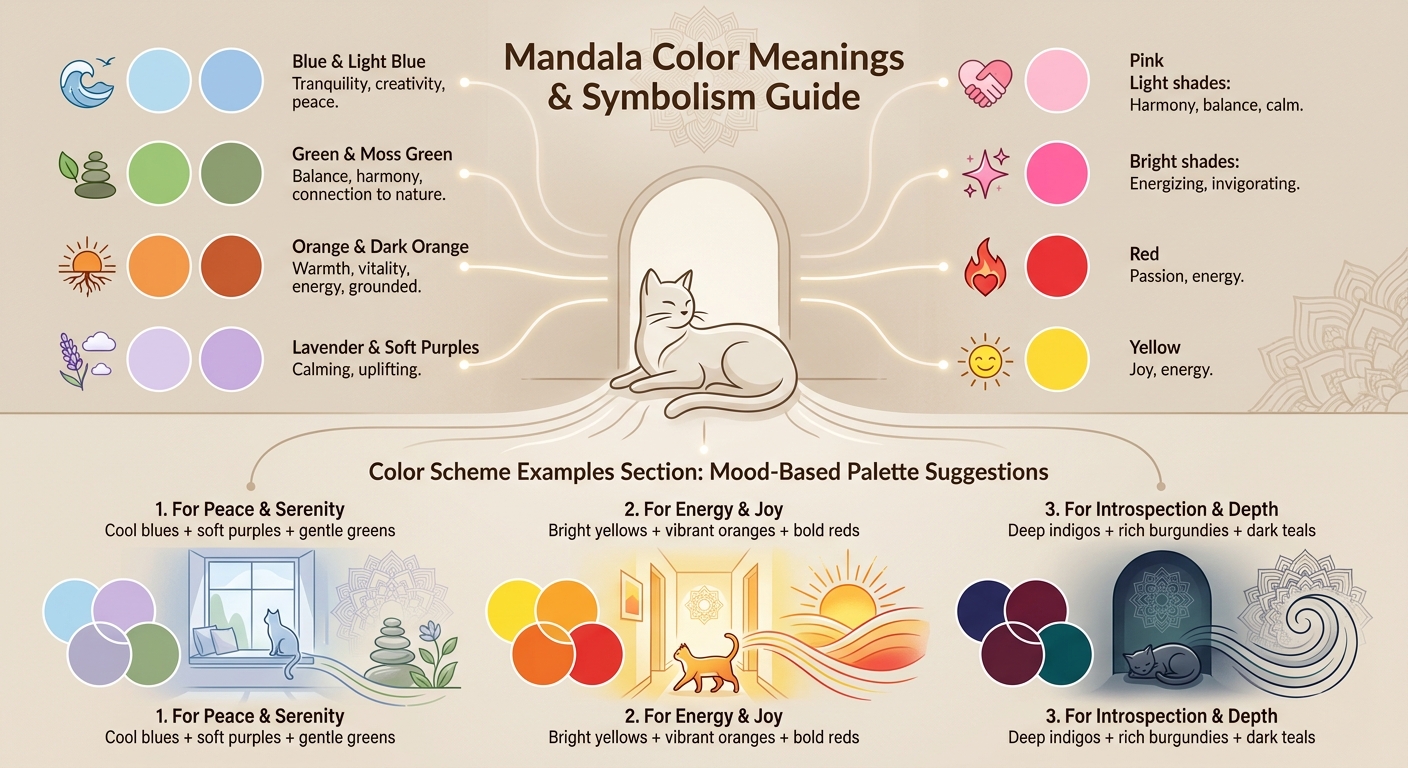
Mandala-Farbbedeutungen und Symbolik-Leitfaden
Was verschiedene Farben bedeuten
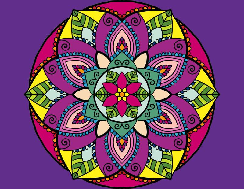
Farben tragen eine emotionale und symbolische Bedeutung, und in der Mandala-Kunst können ihre Bedeutungen die Energie und Absicht Ihres Designs prägen. Blau und Hellblau rufen ein Gefühl von Ruhe, Kreativität und Frieden hervor und eignen sich daher ideal für meditative Designs. Grün und Moosgrün sind mit Ausgeglichenheit, Harmonie und einer Verbindung zur Natur verbunden. Wenn Sie Lebendigkeit und Energie hinzufügen möchten, bringen Orange und Dunkelorange Wärme und Vitalität, während sie das Design geerdet halten.
Für eine beruhigende und aufmunternde Note eignen sich Lavendel und sanfte Violetttöne hervorragend. Pink, mit seiner doppelten Natur, bietet sowohl Harmonie als auch Ausgeglichenheit – hellere Töne bringen ein Gefühl der Ruhe, während hellere Pinktöne beleben und erfrischen. Rot und Gelb sind kühne Entscheidungen, die Leidenschaft, Energie und Freude symbolisieren, während tiefe Indigotöne, Burgunderrot und dunkle Petroltöne ein Gefühl von Nachdenklichkeit, Geheimnis und tiefgründiger Tiefe verleihen.
Indem Sie diese Bedeutungen verstehen, können Sie Farben wählen, die mit Ihren persönlichen Absichten und den Emotionen übereinstimmen, die Ihr Mandala vermitteln soll.
Farbauswahl basierend auf Ihrer Absicht
Die Farben, die Sie wählen, sollten mit der Stimmung oder Energie resonieren, die Sie ausdrücken möchten. Wenn Ihr Ziel beispielsweise ist, ein Gefühl von Frieden und Stressabbau zu schaffen, sind kühle Töne wie Blau und Grün ideal. Wenn Sie hingegen kreative Inspiration oder einen Energieschub suchen, sind hellere Farbtöne wie Rot und Orange passender. Nehmen Sie sich einen Moment Zeit, um über Ihre aktuelle Stimmung oder das Thema, das Sie erkunden möchten, nachzudenken, bevor Sie Ihre Palette festlegen.
Für einen beruhigenden und minimalistischen Ansatz kann ein monochromatisches Schema – wie die Verwendung von hellem Seegrün – einen heiteren und subtilen Effekt erzeugen. Wenn Sie Eleganz anstreben, sollten Sie Königsblau oder sanfte Pastelltöne wie helles Moosgrün in Betracht ziehen. Das Verbinden Ihrer Farbwahl mit Ihren Meditationszielen ermöglicht es dem Mandala, die emotionale Erfahrung, die Sie anstreben, widerzuspiegeln und zu verstärken. Der Schlüssel liegt darin, absichtlich zu sein und sicherzustellen, dass jede von Ihnen gewählte Farbe einem Zweck dient.
Farbkombinationen für bestimmte Stimmungen
Durchdachtes Kombinieren von Farben kann die Stimmung Ihres Mandalas verstärken. Analoge Schemata, die Farben verwenden, die im Farbkreis nebeneinander liegen, schaffen harmonische und natürliche Designs. Komplementäre Schemata hingegen paaren Gegensätze, um auffällige Kontraste und lebendige Energie zu erzeugen. Für einen ausgewogenen und dennoch kühnen Effekt kombinieren triadische Schemata drei gleichmäßig verteilte Farben und bieten dynamische und visuell ansprechende Ergebnisse.
Für ein fröhliches und energiegeladenes Gefühl mischen Sie leuchtendes Gelb, lebendiges Orange und kräftiges Rot. Wenn Ruhe und Frieden Ihr Ziel sind, wählen Sie kühles Blau, sanftes Violett und zartes Grün. Für Introspektion und Tiefe eignen sich tiefe Indigotöne und satte Burgundertöne wunderbar. Das Testen dieser Kombinationen auf Schmierpapier kann Ihnen helfen zu sehen, wie die Farben interagieren und sicherstellen, dass sie mit der Stimmung übereinstimmen, die Sie erzeugen möchten. Durchdachtes Experimentieren kann zu einem Design führen, das sowohl absichtlich als auch zutiefst persönlich wirkt.
So platzieren Sie Farben in Ihrem Mandala
Aufbauend auf Ihrem Verständnis der Farbbedeutungen wollen wir nun untersuchen, wie Farben in Ihrem Mandala durchdacht angeordnet werden.
Beginnen Sie mit einer klaren Absicht
Bevor Sie mit dem Ausmalen beginnen, nehmen Sie sich einen Moment Zeit, um darüber nachzudenken, was Ihr Mandala vermitteln soll – sei es Ruhe, Freude oder tiefe Selbstbeobachtung. Diese Absicht wird Ihre Farbwahl leiten. Wenn Ihr Ziel zum Beispiel Frieden ist, neigen Sie vielleicht zu sanften Violetttönen und zarten Grüntönen. Wenn Sie hingegen Energie und Wärme kanalisieren, wären leuchtende Orangetöne und kräftige Rottöne passender. Diese Klarheit von Anfang an hilft Ihnen, Ihre Entscheidungen nicht zu hinterfragen und stellt sicher, dass Ihr Design emotional konsistent wirkt.
Wählen Sie Ihre Kernfarbpalette
Beginnen Sie mit der Auswahl von 2-3 Hauptfarben, die als Grundlage für Ihr Mandala dienen sollen. Eine begrenzte Palette hält Ihr Design visuell harmonisch und überfordert das Auge nicht. Verwenden Sie einen Farbkreis als Hilfe bei der Entscheidung: Analoge Farben (die nebeneinander im Kreis liegen, wie Blau, Blaugrün und Grün) erzeugen einen beruhigenden, natürlichen Effekt, während komplementäre Farben (Gegensätze im Kreis, wie Blau und Orange) Kontrast und Energie hinzufügen. Sobald Sie sich für Ihre Kernfarben entschieden haben, können Sie ein oder zwei komplementäre Schattierungen hinzufügen. Testen Sie Ihre Palette auf Schmierpapier, um sicherzustellen, dass die Farben gut zusammenpassen und ausgewogen wirken.
Tiefe mit Farbverläufen und Kontrasten hinzufügen
Um einen flachen Look zu vermeiden, fügen Sie Tiefe hinzu, indem Sie drei Schattierungen derselben Farbe innerhalb einer einzelnen Form verwenden. Sie könnten beispielsweise die dunkelste Schattierung am unteren Rand oder an den äußeren Kanten anwenden, eine mittlere Schattierung in der Mitte und die hellste Schattierung zur Mitte oder Spitze hin. Diese Technik, oft bei Blütenblättern angewendet, erzeugt einen dreidimensionalen Effekt. Um noch mehr visuelles Interesse zu wecken, kombinieren Sie warme Farben wie Rot und Orange mit kühlen Tönen wie Blau und Grün. Der Kontrast zwischen diesen Farbtemperaturen zieht das Auge auf natürliche Weise an. Für ein poliertes Finish verwenden Sie einen Verblendstift, um Übergänge zu glätten und ein geschichtetes, kohäsives Aussehen zu erzeugen.
Symmetrie bewahren und Weißraum nutzen
Mandalas basieren auf radialer Balance, wobei sich Elemente symmetrisch vom Zentrum ausbreiten. Während Sie ausmalen, arbeiten Sie in konzentrischen Ringen oder sich wiederholenden Mustern, um diese Symmetrie beizubehalten. Wenn Sie beispielsweise ein Blütenblatt mit einem Farbverlauf schattieren, wiederholen Sie denselben Farbverlauf auf allen entsprechenden Blütenblättern um den Kreis herum. Scheuen Sie sich nicht, einige Bereiche unausgemalt zu lassen – Weißraum kann die Gesamtbalance verbessern und verhindern, dass das Design zu überladen wirkt. Sie können auch einen Gelschreiber verwenden, um helle Highlights hinzuzufügen, die dunklere umgebende Farben hervorheben und einen Hauch von Dimension hinzufügen.
Arbeit überprüfen und anpassen
Treten Sie alle 15-20 Minuten von Ihrem Mandala zurück, um es mit frischen Augen zu betrachten. Diese Pause hilft Ihnen, Bereiche zu erkennen, die zu dicht oder zu spärlich wirken könnten. Nehmen Sie bei Bedarf kleine Anpassungen vor – vielleicht fügen Sie einen helleren Farbton hinzu, um einen Abschnitt aufzuhellen, oder vertiefen einen Schatten für mehr Kontrast. Um die Harmonie zu bewahren, versuchen Sie, maximal acht Farben im gesamten Design zu verwenden. Vertrauen Sie Ihrem Instinkt, während Sie Ihre Arbeit verfeinern. Dieser achtsame Prozess stellt sicher, dass Ihr Mandala nicht nur ausgewogen aussieht, sondern auch mit der Emotion oder Energie in Resonanz steht, die Sie ausdrücken wollten.
Fortgeschrittene Techniken für das Mandala-Ausmalen
Sobald Sie die Grundlagen der Farbplatzierung beherrschen, können Ihnen diese fortgeschrittenen Methoden helfen, Ihre Mandala-Kunst zu verfeinern. Jede Technik konzentriert sich weiterhin auf sorgfältige Farbauswahl und die emotionale Wirkung Ihres Designs.
Farben mischen und schichten
Bringen Sie Farbverläufe auf die nächste Ebene, indem Sie mit verschiedenen Nuancen und Texturen experimentieren. Beginnen Sie mit zwei oder drei Tönen aus derselben Farbfamilie – wie Hellrosa, mittleres Rosa und Tiefburgunder. Tragen Sie den dunkelsten Farbton auf den Grund oder die äußeren Ränder einer Form auf, verblenden Sie den mittleren Ton in die Mitte und schließen Sie mit dem hellsten Farbton an der Spitze oder in der Mitte ab. Das Überlappen dieser Nuancen erzeugt einen sanften, fließenden Farbverlauf.
Für ein poliertes Finish verwenden Sie einen farblosen Verblendstift, um Übergänge zwischen Buntstiftschichten weicher zu machen und Ihrer Arbeit ein malerisches Aussehen zu verleihen. Wenn Sie mit Markern arbeiten, sind alkoholbasierte Optionen ideal für nahtloses Verblenden. Kombinieren Sie sie mit dickem, glattem, beschichtetem Papier, um ein Ausbluten der Tinte zu vermeiden. Um Highlights hinzuzufügen oder Licht zu reflektieren, wirkt ein weißer Gelschreiber Wunder. Für größere Abschnitte probieren Sie Techniken wie Stippling (winzige Punkte) oder Kreuzschraffur (sich kreuzende Linien) aus, um Textur zu erzeugen. Diese Methoden fügen Tiefe und Dimension hinzu und bilden die Grundlage für komplizierte Punktmuster.
Punktmuster zu Ihrem Mandala hinzufügen
Punktmuster verleihen Textur und Komplexität und lenken die Aufmerksamkeit auf bestimmte Bereiche. Feine Stifte (von 0,1 mm bis 0,5 mm) sind perfekt für diese Technik. Fügen Sie Punktegruppen entlang von Blütenblatträndern, innerhalb geometrischer Formen oder von der Mitte nach außen strahlend hinzu. Um die Symmetrie zu wahren, halten Sie die Punktgrößen innerhalb jedes Abschnitts konsistent, variieren Sie sie aber zwischen den Schichten, um einen rhythmischen Effekt zu erzielen.
Wählen Sie lebendige Grundfarben, wie Königsblau oder Tiefviolett, um Ihre Punkte hervorzuheben. Ein dunkler Hintergrund kann hellere Punkte dramatisch hervorheben, während ein heller Hintergrund dunklere Punkte ergänzt. Gleichmäßiger Abstand ist entscheidend, um das beruhigende und meditative Gefühl des Mandalas zu bewahren. Wiederholen Sie dieselben Punktfarben in symmetrischen Abschnitten, um das Gleichgewicht zu erhalten. Diese Muster legen den Grundstein für kühne Kontrasteffekte.
Hochkontrasteffekte erzeugen
Hoher Kontrast kann bestimmte Elemente Ihres Mandalas hervorheben und gleichzeitig Harmonie bewahren. Kombinieren Sie helle Farben (wie Hellblau, Gelb oder Hellgrün) mit dunkleren Tönen (wie Marineblau, Burgunderrot oder Waldgrün) für beeindruckende Ergebnisse. Komplementärfarben von gegenüberliegenden Seiten des Farbkreises – wie Blau und Orange oder Lila und Gelb – können Ihrem Design Lebendigkeit und Definition verleihen.
"Die Verwendung von dunklen und hellen Farben nebeneinander schafft Balance in Ihrem Mandala." - Aletta Simpson, Illustratorin
Um das Design nicht zu überladen, beschränken Sie jede kreisförmige Schicht auf drei Farben. Wenn Ihre Palette warm ist (Rot- und Orangetöne), fügen Sie einen einzigen kühlen Akzent hinzu, wie einen türkisfarbenen Punkt oder einen blauen Glanzpunkt, um einen Blickfang zu schaffen. Metallic- oder Glitzerstifte können subtile Highlights hinzufügen, die das Licht einfangen, aber verwenden Sie sie sparsam, um den besten Effekt zu erzielen. Testen Sie Farbkombinationen immer auf Schmierpapier, bevor Sie sich für Ihr Design entscheiden. Diese Techniken bauen auf Ihren grundlegenden Fähigkeiten auf und eröffnen die Tür zu noch detaillierteren und ausdrucksstärkeren Kreationen.
Tipps für ausgewogene, bedeutungsvolle Mandalas
Ein Mandala zu erstellen, dreht sich genauso um Achtsamkeit wie um Design. Diese Tipps bauen auf früheren Techniken auf und helfen Ihnen, visuelle Harmonie zu bewahren, während Sie Ihr Mandala mit persönlicher Bedeutung versehen. Jeder Vorschlag ist ein Schritt zu einem ausgewogeneren und bewussteren Endwerk.
Testen Sie Ihre Farben zuerst
Bevor Sie sich in Ihr Hauptdesign stürzen, nehmen Sie sich einen Moment Zeit, um Ihre Farbpalette auf Schmierpapier zu testen. Dieser einfache Schritt lässt Sie sehen, wie Farben auf Ihrer gewählten Oberfläche interagieren, ob Sie komplementäre Kontraste oder sanftere, analoge Töne anstreben. Er hilft Ihnen auch, die Sättigung einzuschätzen und stellt sicher, dass Ihre Werkzeuge gut mit Ihren Materialien harmonieren. Bei digitalen Designs sind Ebenen Ihr bester Freund – experimentieren Sie mit verschiedenen Farbkombinationen und Schattierungsstilen, ohne Ihr ursprüngliches Layout zu beeinflussen.
Von der Mitte nach außen arbeiten
Das Beginnen in der Mitte Ihres Mandalas hält das Design fokussiert und geordnet, während es sich ausdehnt. Betrachten Sie die Mitte als das Herz Ihrer Kreation und füllen Sie ihre Formen mit einer Farbe, bevor Sie sich nach außen bewegen. Dieser Ansatz gewährleistet einen konsistenten Fluss und verhindert, dass das Stück chaotisch wirkt. Beschränken Sie sich auf maximal drei Farben pro "Runde", um die Kohäsion zu erhalten, und wechseln Sie zwischen hellen und dunklen Tönen, um Tiefe zu verleihen und komplizierte Muster hervorzuheben. Während Sie sich nach außen bewegen, lassen Sie Ihre Emotionen Ihre Entscheidungen leiten und verleihen Sie dem Design eine persönliche Note.
Denken Sie über Ihre Farbwahl nach
Farben tragen emotionale Bedeutung, nehmen Sie sich also Zeit, Farbtöne zu wählen, die mit der Stimmung übereinstimmen, die Sie vermitteln möchten. Zum Beispiel steht Blau oft für Ruhe und Kreativität, Grün deutet auf Harmonie hin, und Rosa kann je nach Ton beruhigend oder belebend wirken. Ob Sie kühne Kontraste zur Ausdruckskraft von Vitalität oder sanfte Harmonien für eine ruhige Atmosphäre anstreben, Ihre Palette kann Ihr Mandala von einem einfachen Design zu einer bedeutungsvollen Reflexion Ihrer Absichten erheben. Dieser durchdachte Ansatz verbessert das meditative Erlebnis und verleiht sowohl dem Prozess als auch dem fertigen Werk Tiefe.
Fazit: Mit Achtsamkeit und Freude schaffen
Seien Sie stolz auf Ihre Arbeit
Ein Mandala fertigzustellen, ist mehr als nur ein künstlerisches Projekt abzuschließen – es ist ein Moment, um Ihre Kreativität und Mühe zu feiern. Jede Wahl, von den Farben, die Sie wählen, bis zu den Mustern, die Sie formen, trägt ein Stück Ihrer Persönlichkeit. Ob Ihr Design traditionellen Mustern treu bleibt oder einen experimentelleren Weg einschlägt, es spiegelt Ihre einzigartige Perspektive wider. Das Ausstellen Ihres Mandalas kann als tägliche Erinnerung an diese Errungenschaft dienen, Ihre Umgebung verschönern und gleichzeitig ein Gefühl persönlicher Erfüllung fördern.
Farben für Ruhe und Verbindung nutzen
Das Ausmalen von Mandalas ist mehr als nur ein kreativer Ausgleich – es ist eine beruhigende Übung, die ein Gefühl der Ruhe und des emotionalen Gleichgewichts fördert. Die Auswahl der Farben und das sorgfältige Ausfüllen komplexer Formen beruhigen den Geist und verwandeln den Prozess in eine bedeutungsvolle Form der Selbstfürsorge. Studien deuten sogar darauf hin, dass das Ausmalen von Mandalas das emotionale Wohlbefinden steigern kann, besonders in gemeinsamen Settings, in denen Verbundenheit und Kreativität gedeihen. Konzentrieren Sie sich beim Erkunden der Platzierung von Farben und Mustern auf das Erlebnis selbst. Jedes fertiggestellte Mandala steht als Symbol für die Ruhe und Achtsamkeit, die Sie auf dieser künstlerischen Reise kultiviert haben.
FAQs
Wie wähle ich Farben aus, wenn ich meine Absicht noch nicht kenne?
Wenn Sie unsicher sind, wo Sie anfangen sollen, versuchen Sie es mit einem intuitiven Ansatz. Schließen Sie die Augen, wählen Sie Farben zufällig aus und lassen Sie sich von Ihrem Instinkt leiten. Diese Methode fördert ein Gefühl der Freiheit und kann Ihnen helfen, Ihre Emotionen zu erfassen, ohne zu viel nachzudenken. Eine andere Möglichkeit ist, sich auf nur drei Farben zu beschränken und sich darauf zu konzentrieren, wie sie miteinander interagieren und sich ergänzen. Oft kann diese Art spielerischer Experimente zu überraschender und bedeutungsvoller Harmonie in Ihrer Mandala-Kunst führen.
Was kann ich tun, wenn mein Mandala ungleichmäßig oder unausgewogen aussieht?
Wenn Ihr Mandala unausgewogen wirkt, achten Sie auf Symmetrie und Proportionen. Hilfsmittel wie konzentrische Kreise oder ein Raster können Ihnen helfen, das Design konsistent zu halten. Werkzeuge wie ein Zirkel oder Lineal sind praktisch, um präzise Formen zu zeichnen. Die bewusste Auswahl von Farben – ob harmonisch oder kontrastreich – kann Ihrem Werk auch ein Gefühl von Ausgewogenheit verleihen. Mit Geduld und sorgfältiger Planung wird Ihr Mandala raffinierter und optisch ansprechender wirken.
Wie kann ich eine Farbauswahl korrigieren, die ich bereue, ohne neu anfangen zu müssen?
Wenn Sie mit einer Farbwahl unzufrieden sind, machen Sie sich keine Sorgen – es gibt Möglichkeiten, dies anzupassen. Versuchen Sie, Farben zu mischen, um den Effekt abzumildern, oder eine andere Schattierung darüberzulegen, um ein ausgewogeneres Aussehen zu erzielen. Dies funktioniert besonders gut mit Werkzeugen wie Buntstiften oder Markern, bei denen das Mischen dazu beitragen kann, harte Übergänge zu glätten. Wenn sich die Farbe immer noch fehl am Platz anfühlt, kann das Überdecken mit einem neuen Farbton helfen, sie in das Gesamtdesign zu integrieren. Denken Sie daran, was wie ein Fehler erscheinen mag, kann tatsächlich kreative Ideen anregen, also nutzen Sie es als Gelegenheit zum Experimentieren und Erkunden neuer Techniken!