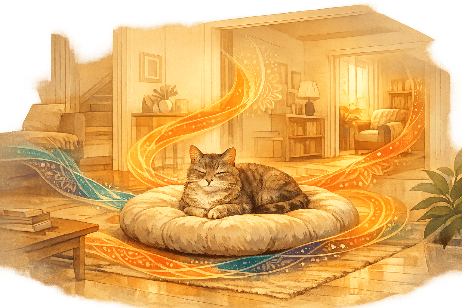
Colors can change how you feel. Whether it’s the calming effect of blue, the focus boost from green, or the energy of red, color therapy uses these effects to improve your mood and well-being. Here’s how:
- Blue: Reduces stress, lowers heart rate, and promotes relaxation.
- Green: Boosts creativity and focus, offering a balance between calm and stimulation.
- Warm Colors (Red, Orange, Yellow): Energize and spark motivation when used sparingly.
- Minimalist Design: Combines vibrant colors with simple patterns to avoid visual clutter and foster calm.
From a soothing yoga mat to a cheerful tote bag, thoughtful color choices in your daily items and home decor can create spaces that energize and relax you. Each color serves a purpose - whether it’s for meditation, journaling, or simply unwinding at home.
Start small: Add calming blues or energizing yellows to your routine with items like cushions, journals, or wall art. Over time, these choices can transform how you feel every day.
How Colors Affect Your Mood and Mental Health
Color and emotion are deeply connected, and this connection forms the basis of Blululi's mindful design philosophy. Every product we create is meant to inspire balance and clarity. For instance, a pop of yellow in your journal could ignite your creativity, while a soft blue yoga mat may help you sink into a serene meditative state.
How Your Brain Responds to Different Colors
Your brain processes colors in ways that directly impact emotions. In fact, research shows that about 90% of snap judgments are influenced by the psychological effects of color[1]. Different hues evoke different reactions. For example, red often stirs the strongest emotional response, while blue has a calming effect, and green lands somewhere in the middle. A study from the University of Rochester even found that participants scored 20% lower on tests when exposed to red beforehand[2]. This suggests that red's ability to heighten arousal can sometimes interfere with focus and performance.
"It's amazing how colors can truly impact our mood and influence our behavior." - Rachel Goldman, PhD
Blue, on the other hand, is nature's relaxant. It’s been shown to lower blood pressure and heart rate, making it perfect for moments of calm and reflection. Imagine a meditation cushion adorned with soft blue mandala designs - it could naturally encourage your body to relax and unwind.
Green strikes a balance between calm and stimulation, making it a great choice for boosting focus and creativity. Studies suggest that adding green to your workspace can enhance creativity by up to 15% and improve productivity by 6%. This makes green-accented items ideal for areas where you journal, brainstorm, or tackle tasks requiring mental clarity.
The intensity of a color also plays a key role. Bright, saturated hues tend to evoke stronger emotions, while softer tones create gentler effects. For instance, a bright teal might energize your morning routine, while a muted sage green could help you wind down in the evening.
By blending these insights with a minimalist design approach, the calming effects of color can be amplified even further.
Finding the Right Mix of Bright Colors and Simple Design
Pairing vibrant colors with minimalist designs creates a sense of emotional balance. Research shows that too much visual clutter can increase stress, while simplicity fosters calm and order. As Emily Winer from WELL Certification's Mind concept explains:
"Colour is one of the many ways to bring nature-inspired design into buildings, which can help relieve stress and mental fatigue, support focus, and encourage overall well-being." - Emily Winer, WELL Certification's Mind concept
For instance, a bold geometric pattern on a simple tote bag can brighten your mood without overwhelming your senses. Similarly, a vibrant mandala design on a neutral background can add visual interest while preserving the tranquility essential for meditation or yoga. This reflects Blululi's philosophy of balancing energy with calm.
This works because your brain processes visual information in layers. Saturated colors can energize and evoke high-arousal emotions, but when paired with clean, minimalist designs, they create a lively yet soothing effect. At the same time, the simplicity of the design provides the visual rest your mind needs to fully appreciate the bold hues.
| Color Approach | Emotional Impact | Best Used For |
|---|---|---|
| Warm Colors (Red, Orange, Yellow) | Energy and Comfort | Morning routines, creative spaces (in moderation) |
| Cool Colors (Blue, Purple, Green) | Calmness and Tranquility | Meditation, relaxation, sleep areas |
| Neutral with Color Accents | Stability and Calmness | Daily-use items, balanced living spaces |
This table highlights how different color strategies can enhance your emotional well-being. Of course, color preferences are personal and shaped by individual experiences and contexts. The goal isn’t to follow strict rules but to create a color palette that supports your daily rituals and nurtures a mindful lifestyle.
Adding Color Therapy to Your Daily Routine
The colors you surround yourself with can have a surprising impact on how you feel throughout the day. By choosing colors intentionally, you can subtly influence your mood and energy levels, making color a powerful addition to your wellness routine. These small, thoughtful adjustments align beautifully with a mindful, balanced lifestyle, seamlessly complementing the design principles we've explored earlier.
Think of your home as a canvas, with each space designed to serve a specific emotional purpose. By using colors strategically, you can create natural transitions between work, relaxation, and creativity. Moving between these spaces or interacting with colorful objects can act as a quick mental reset, helping you stay grounded and focused.
Setting Up a Meditation Space with the Right Colors
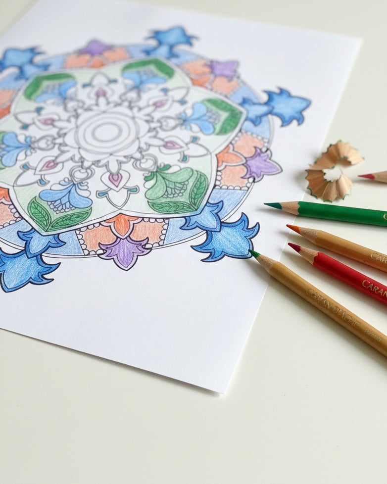
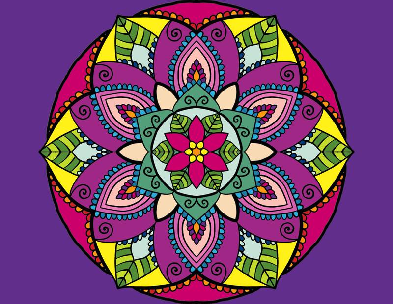
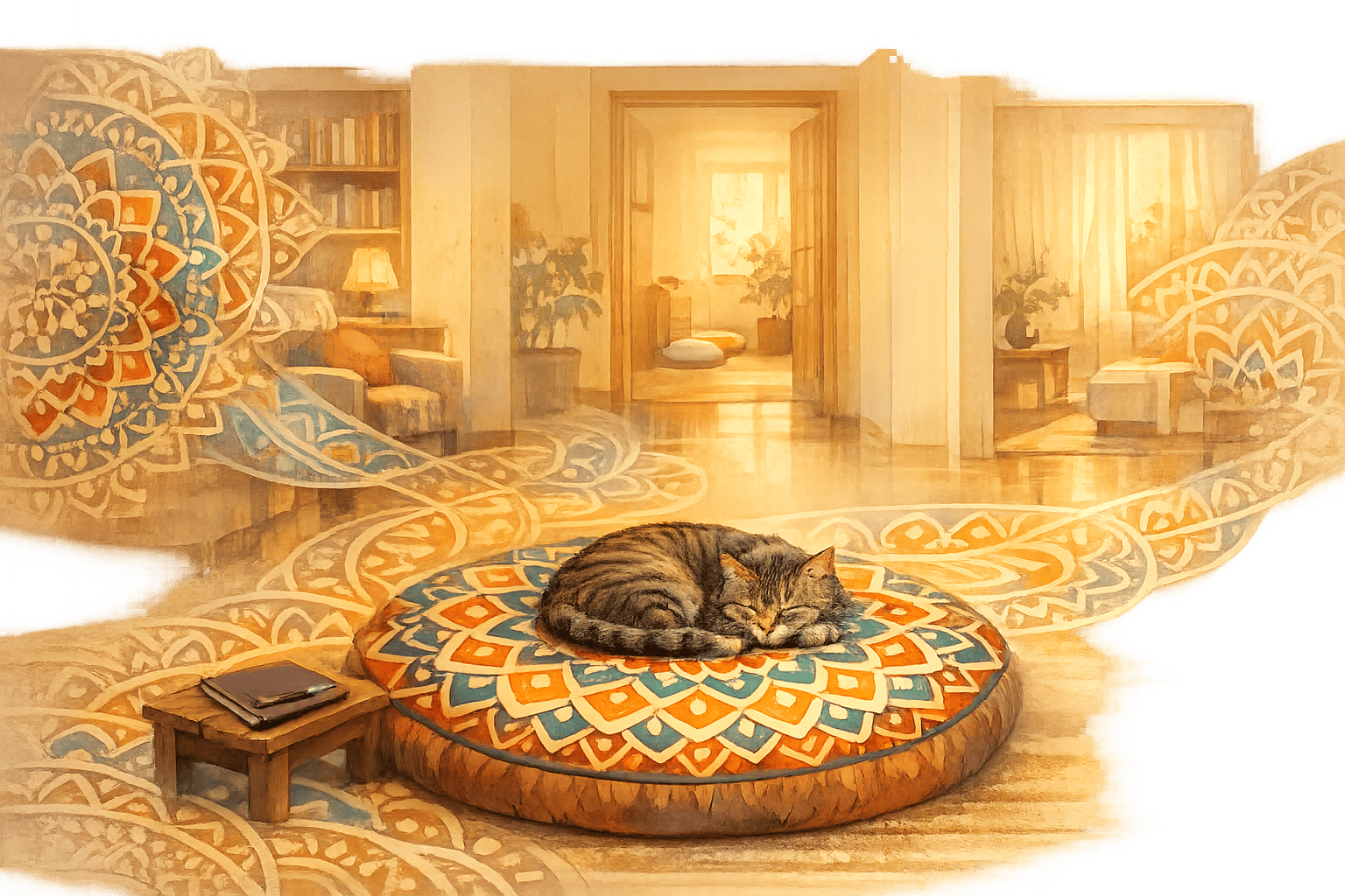
Your meditation space should feel like a personal retreat, a place where your mind and body can unwind. Start with a mandala-inspired yoga mat in calming shades of blue or green. These colors naturally encourage relaxation, while the intricate mandala patterns gently draw your focus inward. Position your mat near a window to let in natural light, enhancing the serenity of the space.
To deepen the calming atmosphere, consider wall art in rich indigo tones. Mandala designs in soft purples or deep blues are particularly effective for promoting introspection and reducing mental clutter. These colors create a peaceful backdrop, perfect for quiet moments of reflection.
Add a cozy floor cushion in warm earth tones such as terracotta, beige, or sage green. These hues evoke feelings of safety and emotional warmth, grounding your practice. When combined with the cool tones of your mat and wall art, they create a harmonious balance that supports both mental clarity and emotional well-being.
Don't overlook the lighting. Soft, warm lighting - reminiscent of candlelight - can enhance the soothing effects of your chosen colors. Avoid harsh overhead lights that might disrupt the tranquil vibe you've worked to create.
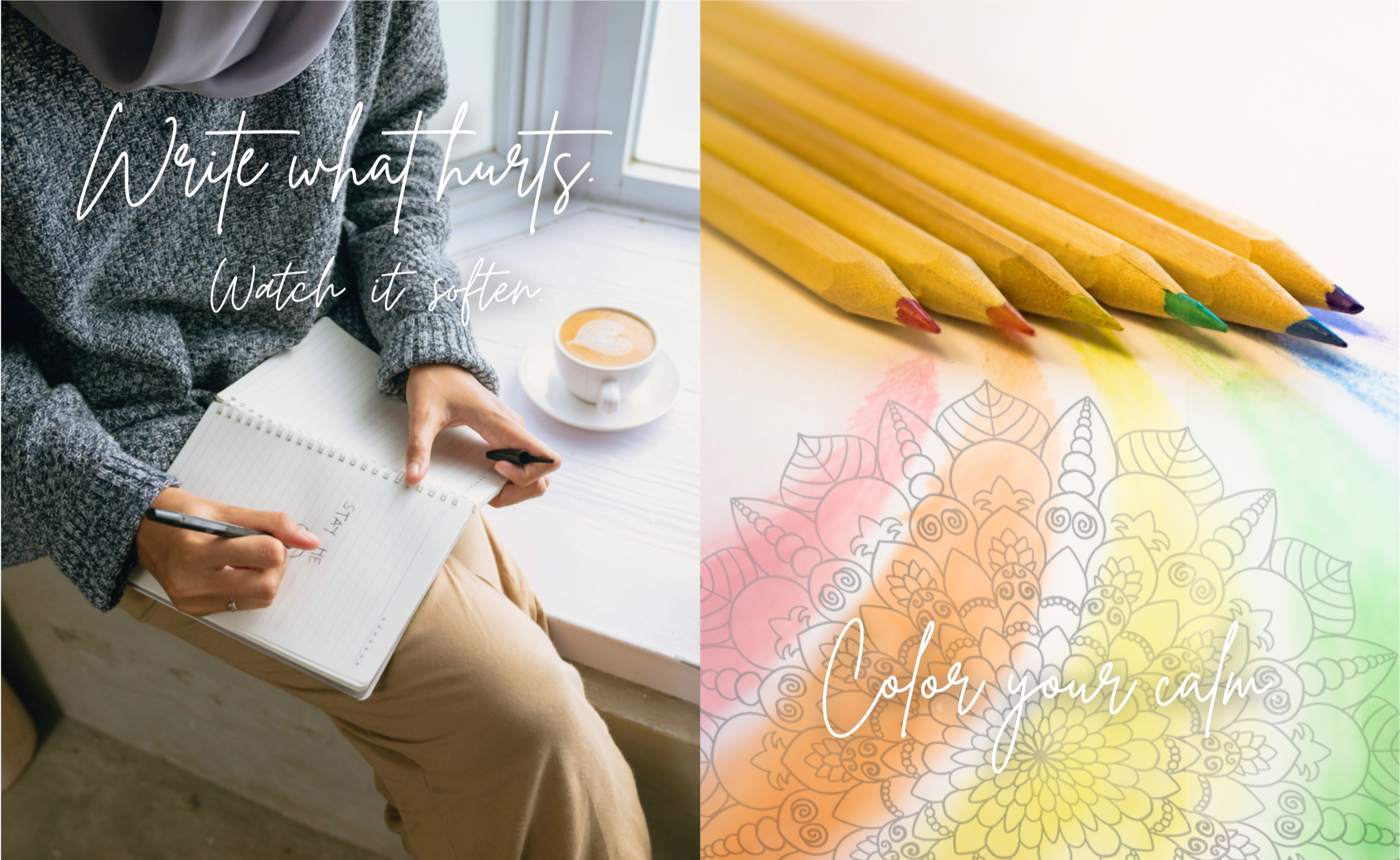
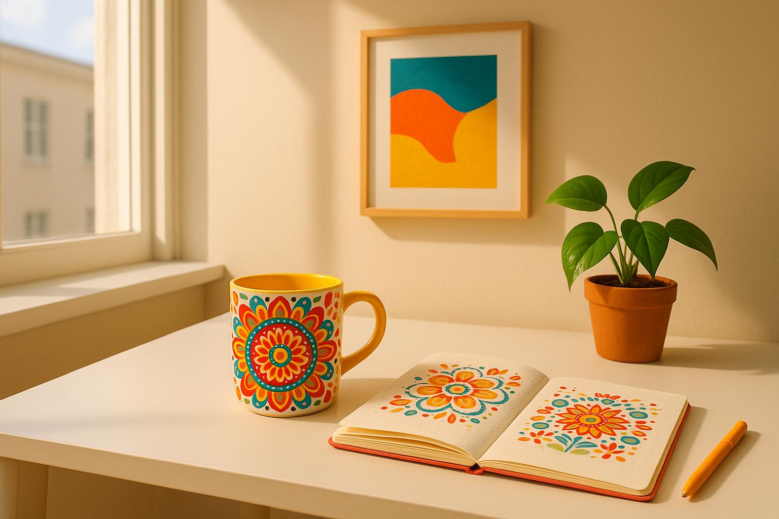
Using Colorful Items to Boost Journaling and Writing
Just like meditation, journaling can benefit from the thoughtful use of color. Surrounding yourself with hues that spark creativity and focus can make your writing sessions more enjoyable and productive.
Start with a vibrant tote bag in shades of blue or teal to store your journaling essentials. Not only does it keep everything organized, but it also acts as a visual cue, signaling that it's time to shift into a creative mindset. Inside, keep your journal, colored pens, and any prompts you use to inspire your writing.
For morning journaling, soft peach tones can help lift your mood and combat mental fatigue. Opt for a peach-colored journal cover or writing accessories to energize your thoughts when you're feeling sluggish.
Create a cozy journaling nook with a mix of therapeutic colors. A mint green throw blanket can bring a sense of renewal, while a journal featuring mandala designs in various hues allows you to choose colors that match your mood. Some days, calming blues might feel right, while on others, the playful energy of soft corals could be just what you need.
"It's not about creating perfectly; it's about creating freely." – Mindful Creative Muse
Let this philosophy guide your color choices. Instead of aiming for perfect coordination, focus on how each color makes you feel as you write. A collection of colorful pens, a vibrant journal, and a snug blanket can transform any corner into a haven for creativity.
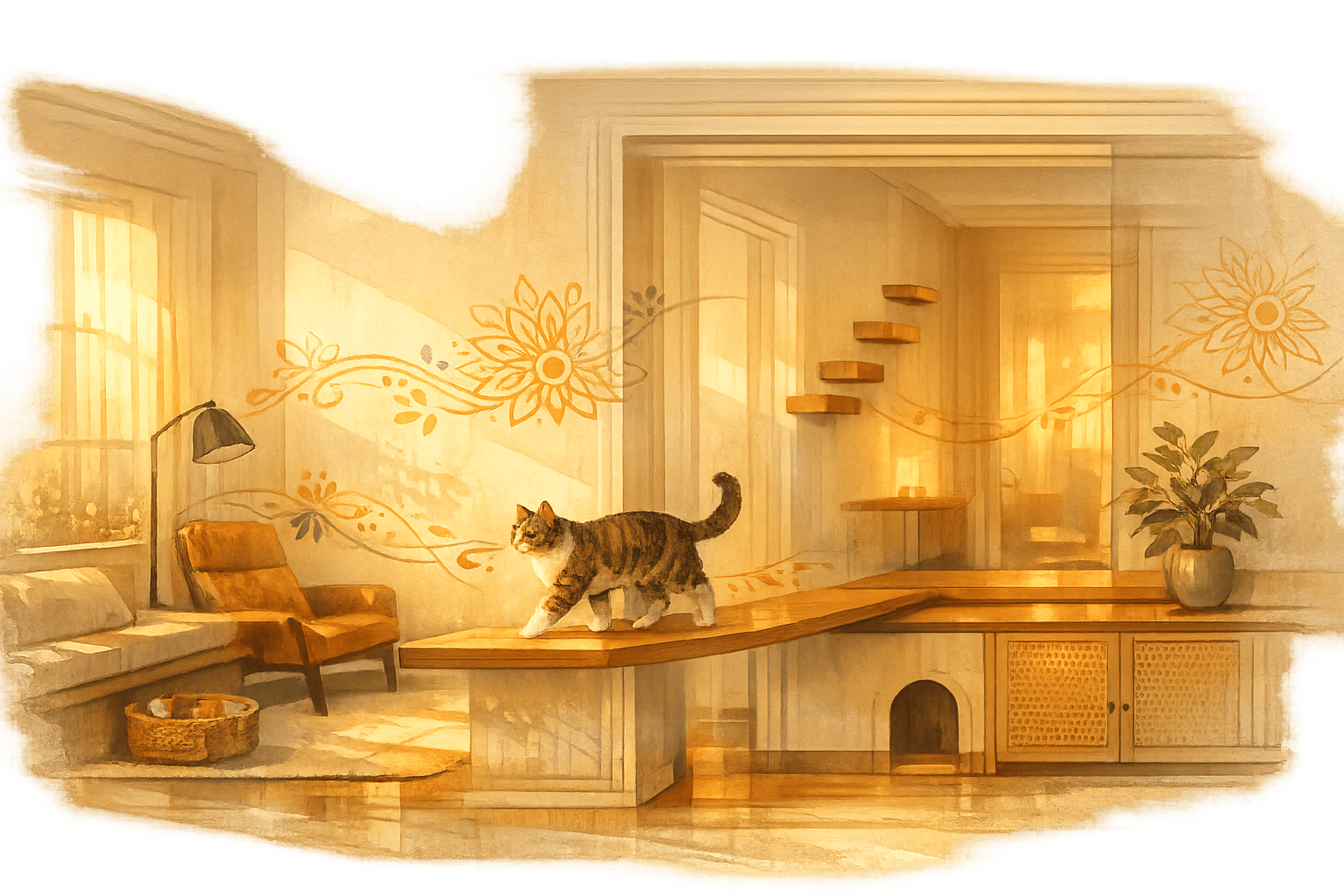
Creating a Relaxing Home with Colorful Decor
Your home should be a place where you can shift effortlessly between different moods, and color can help make that happen. Start with a base of warm white tones to create a sense of openness and calm without feeling sterile.
Textiles are an easy way to introduce color therapy into your home. A lavender throw pillow can turn your reading nook into a peaceful retreat, while a teal blanket can add a burst of energy to your mornings. In the kitchen or dining area, soft peach and coral tones can provide a gentle recharge, especially during stressful times.
For your bedroom, focus on colors that encourage rest and emotional processing. Lavender promotes deep relaxation, while soft blues can naturally lower your heart rate. A mandala-patterned duvet cover in these shades can help create a sleep-friendly environment that aligns with your body's natural rhythms.
Living rooms often serve multiple purposes, so aim for a balance of energy and calm. A rug with geometric patterns in muted earth tones can provide a grounding effect, while accent pillows in greens or blues can shift the room's atmosphere toward relaxation. Wall art featuring mandala designs in a range of soothing colors can act as visual anchors, helping to set the tone for different times of the day.
To tie it all together, use a single vibrant piece - like a mandala wall hanging or a colorful floor cushion - as a focal point. This approach not only enhances the room's emotional energy but also maintains a clean, minimalist aesthetic that supports mental clarity.
sbb-itb-b6c1dc0
How to Use Bright Simple Design in Your Daily Life
Bright simple design brings the uplifting power of color into your everyday routines. By combining functional items with thoughtful color choices, you can create spaces and moments that enhance your mood and well-being. Whether it’s a vibrant mandala wall hanging or a cheerful tote bag, these design elements can subtly support your emotional balance throughout the day. Let’s dive into how this approach can transform your travel essentials and home decor.
Travel and Daily Items: Style That Works
Everyday items don’t have to be boring - they can be practical and inspiring at the same time. A medium canvas tote in bold shades like teal or coral can brighten your day while carrying everything from groceries to weekend getaway essentials. Look for totes with sturdy handles and waterproof linings, so they stay beautiful and functional no matter how much you use them.
"We think of using color as an accent and in a more structured way. It's often a small piece or item relative to the size of the room, but when done in the right way, a little color can pack a big punch." - Jean Liu, Principal Designer and Founder, Jean Liu Design
For travel, lightweight yet stylish accessories are key. A mandala-patterned tote with secure closures offers a mix of bohemian charm and professional polish, making it perfect for both casual outings and business trips. These detailed designs not only add personality but also make it easy to transition seamlessly between different settings.
Think about how your travel items can help you feel grounded no matter where you are. A yoga mat in calming blues or energizing oranges fits easily into most totes, letting you continue your meditation or exercise routine on the go. Pair it with coordinated packing organizers to keep your essentials neat and stress-free during travel.
Home Decor: Adding Color Without Overwhelming Your Space
If you want to bring bright colors into your home without making it feel chaotic, the 60-30-10 rule is a great guideline. Use 60% neutral tones like soft grays or warm whites as your base, 30% bold colors through larger pieces, and 10% accent colors in smaller decorative items.
Start with neutral walls to create a calming foundation, then let your furnishings add personality. A mandala wall hanging in rich purples or deep teals can become the centerpiece of a room, while coordinating throw pillows in similar tones tie the look together. This way, you can experiment with colors without committing to anything permanent.
"Color is a way to uplift our spirits and change the dynamic of our spaces." - Abbey Stark, Interior Design Leader, IKEA U.S.
Textiles are an easy way to introduce color into your home. Swap out pillow covers to fit your mood - try soothing lavenders during stressful times, energizing corals when you need motivation, or grounding earth tones for a sense of stability. A mandala-patterned duvet cover can turn your bedroom into a peaceful retreat, while colorful floor cushions provide flexible seating for any activity.
To keep your space feeling cohesive, repeat colors across different rooms. For example, teal accents in your living room could reappear in the kitchen through matching mugs or table linens, while soft blues in the bedroom might echo in the bathroom with towels. This repetition creates harmony while still allowing each room to serve its unique purpose.
Statement artwork is another way to bring color into your home without overwhelming smaller spaces. A series of mandala prints in clean white frames can add visual interest while maintaining a minimalist vibe. The intricate geometric patterns naturally draw the eye inward, encouraging a sense of calm and focus - perfect for spaces dedicated to mindfulness or relaxation.
In dining areas, colorful linens can completely change the atmosphere. Warm tones like peach and coral can make meals feel lively and social, while cooler shades like blue and green encourage calm, thoughtful conversations. These small changes can adapt your space for different occasions without requiring a full makeover.
Conclusion: Creating Balance with Bright Simple Colors
Finding emotional balance through color therapy doesn't require drastic changes - sometimes, it's the smallest shifts that make the biggest difference. By embracing vibrant yet understated design, you can create spaces that promote mental well-being and a sense of calm.
"Color is a power which directly influences the soul." - Wassily Kandinsky
This idea is supported by the natural connection between colors and emotions. When paired with minimalist design, these connections become even more impactful. Reducing visual clutter while intentionally adding meaningful colors can help foster mental clarity and emotional stability. This philosophy is woven into every Blululi product, blending thoughtful design with scientific understanding.
Take, for example, Blululi's mandala-inspired creations - like a soothing teal wall hanging or a cheerful coral yoga mat. These pieces combine the uplifting energy of color with the simplicity of minimalist design, offering a gentle yet effective way to support your mental health.
The beauty of this approach lies in its personal touch. Start small - maybe with a bright tote bag that lifts your mood during daily errands. Over time, you can expand this mindful practice by adding complementary decor, like soft cushions or cozy throws, to create a cohesive and calming environment. Each piece becomes part of a broader lifestyle that prioritizes mindfulness and emotional well-being.
"Colors have a real direct biological and psychological impact on people. It is necessary to take advantage of them. We should use them as a remedy for anxiety, energy boosting, meditative state induction and improving focus." - Reena Goenka, Registered Counsellor and Clinical Supervisor with Singapore Association for Counsellors
To truly benefit from color therapy, it helps to align your choices with your personal needs. Consider keeping a journal to track how different colors in your surroundings influence your mood. You might notice that deep purple mandala cushions in your reading corner bring a sense of calm, or that bright orange yoga accessories spark motivation for your morning routine.
This isn't about striving for perfection - it's about creating habits that support your well-being over time. By selecting thoughtfully designed pieces that merge functional simplicity with beautiful colors, you can build daily rituals that nurture both your practical needs and emotional health. Each item becomes a gentle reminder to pause, breathe, and reconnect with your inner calm.
FAQs
How can I use color therapy to create a calming and uplifting environment without overdoing it?
You can weave the calming effects of color therapy into your daily life by making simple, intentional choices that enhance your surroundings without overpowering them. Start by selecting hues that align with the mood you’re aiming to create - soft blues to evoke tranquility, sunny yellows to spark joy, or gentle greens to encourage balance. Instead of committing to bold wall colors, try adding these shades through smaller accents like throw pillows, framed artwork, or even candles.
For a more personal and functional touch, consider incorporating uplifting colors into everyday essentials like yoga mats or tote bags featuring cheerful designs. These items not only brighten your day but also keep your space feeling serene and uncluttered. Thoughtfully choosing colors with purpose can help you craft an environment that feels both nurturing and inspiring, perfectly complementing your daily rituals.
How do different colors impact mood and productivity?
Colors play a powerful role in shaping our emotions and influencing how productive we feel. Each color carries its own set of effects on our mental state, making it a valuable tool for designing spaces that align with our needs.
Take red, for instance. It’s a color packed with energy and urgency - great for sparking physical activity or encouraging quick decisions. But too much red? That can tip the scale toward stress or even irritability. Then there’s blue, often associated with calm and focus. It’s the go-to shade for reducing stress and staying locked in on tasks that demand concentration.
Yellow, on the other hand, is all about optimism and creativity. It’s the color that can brighten your mood and inspire fresh ideas. Just be careful not to overdo it - too much yellow can feel overstimulating. And finally, there’s green, the ultimate color for balance and relaxation. It’s a natural fit for mindfulness practices or work sessions that stretch over long hours.
By weaving these colors thoughtfully into your surroundings, you can create an atmosphere that nurtures both emotional well-being and productivity - whether you’re hard at work, meditating, or simply unwinding.
How does minimalist design enhance the effects of color therapy in home decor?
Minimalist design works wonders in highlighting the effects of color therapy. By keeping spaces clean and uncluttered, it allows colors to truly shine, creating an environment that feels calm and focused rather than overwhelming. Soft hues like blues and greens can set a relaxing tone, while warmer shades like yellows and oranges infuse the space with energy and optimism.
Using neutral tones as a base lets brighter colors pop, enhancing their emotional and psychological impact. This careful balance not only gives your home a visually pleasing look but also creates a peaceful retreat that nurtures mindfulness and emotional harmony.